
Typography
scale ratio 1.251- Tobiasdisplay10050%
- ABC Diatypecss: ABCDiatypebody300 400 50041%
- ABC Diatype Monocss: ABCDiatypeMonomono300 4009%
| style | family | size | weight | line | tracking |
|---|---|---|---|---|---|
| display | Tobias | 86.4px | 100 | 1.02 | -0.035em |
| title | Tobias | 34.56px | 100 | 1 | -0.035em |
| body | ABC Diatype | 18px | 300 | 1.45 | 0em |
| body-sm | ABC Diatype | 16px | 300 | 1.5 | 0em |
| label | ABC Diatype | 16px | 400 | 1.75 | 0.003em |
| mono | ABC Diatype Mono | 4.5px | 300 | 1.1 | 0em |
Type scale
Aa4.5Aa10.5Aa11Aa12Aa13Aa14Aa16Aa18Aa20Aa22Aa34.5Aa46Aa65Aa66Aa86.5
- Body size
- 18px / 1.45
- Display size
- 86.4px
- Display tracking
- -0.035em
- Case
- sentence
Color
light schemePalette by painted area
- Text on bg
- 18.86:1
- Muted on bg
- 7.37:1
- Accent on bg
- 14.82:1
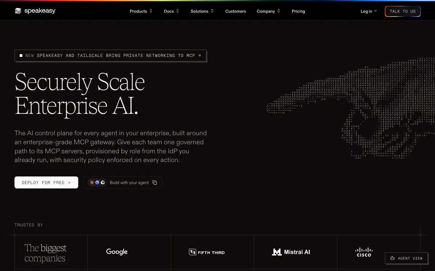
- Dark mode
- follows system
Declared accent tokens
- --color-bsmnt-brand-go#00143Dpainted
- --color-bsmnt-brand-php#330F1Fpainted
- --color-bsmnt-brand-java#2874D7painted
- --color-bsmnt-brand-ruby#FB8841painted
Space, shape & depth
Spacing scale
- 2
- 4
- 6
- 8
- 10
- 12
- 14
- 16
- 20
- 24
- 32
- 40
- 48
- 96
Corner radii
345681012pill
Shadows (5)
- Borders
- hairline, 1px
- Section padding
- 192px
Components
exact computed valuesbutton-primary
Deploy for free
- backgroundColor
- #242428
- textColor
- #FAFAFA
- rounded
- 8px
- padding
- 12px 24px
- height
- 40.8px
- fontFamily
- ABC Diatype Mono
- fontSize
- 14px
- fontWeight
- 300
- shadow
- rgb(65, 65, 65) 0px 2px 1px 0px inset
button-secondary
Agent view
- textColor
- #0F0A07
- rounded
- 0px
- padding
- 10px 16px
- height
- 38px
- fontFamily
- ABC Diatype Mono
- fontSize
- 12px
- fontWeight
- 300
- border
- 1px solid #0F0A073D
- shadow
- rgba(0, 0, 0, 0) 0px 0px 0px 0px, rgba(0, 0, 0, 0) 0px 0px 0px 0px, rgba(0, 0, 0, 0) 0px 0px 0px 0px, rgba(0, 0, 0, 0) 0
card
- rounded
- 4px
- padding
- 0px
- backgroundColor
- #FFFFFF
- border
- 1px solid #0F0A071F
Layout & motion
- Container
- 1344px
- Grid columns
- 2
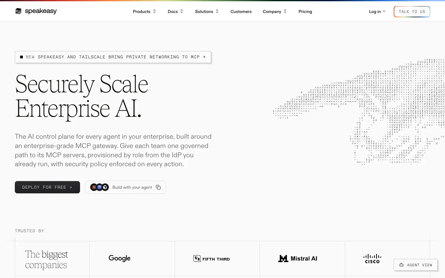
- Hero
- left-over-media
- Navigation
- top-sticky
- Page height
- 11,203px
- Easing
- cubic-bezier(0.4, 0, 0.2, 1)
- Durations
- 150ms 200ms 300ms 500ms
- Transitions
- 113
- Keyframes
- 5
- Stack
- astro, tailwind, radix-ui, posthog, vercel
Page sections (11)
section labels are heuristic 02nav
 03testimonials
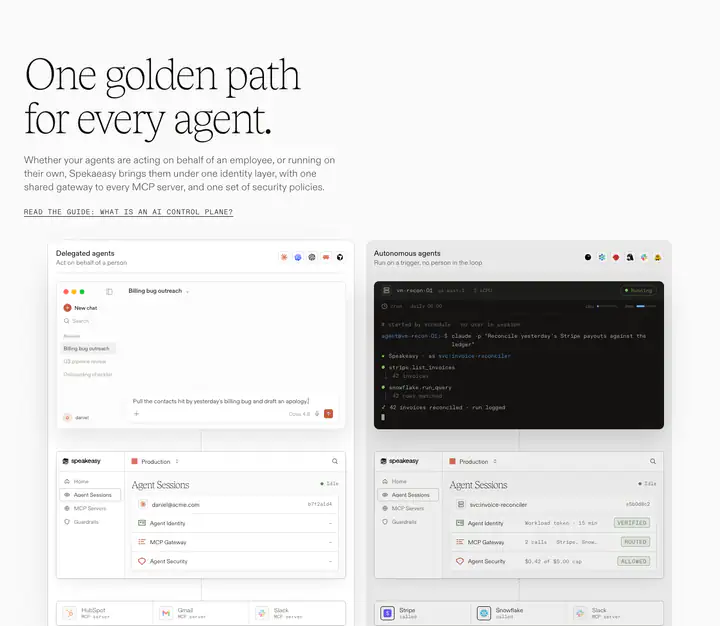 04feature detail?One golden path for every agent.
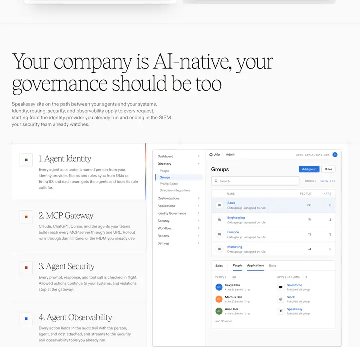 05features?Your company is AI-native, your governance should be too
 06testimonials
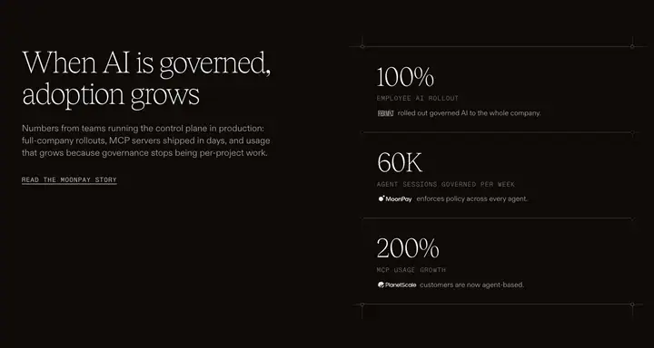 07feature detail?When AI is governed, adoption grows
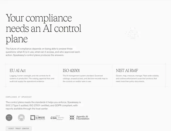 08features?Your compliance needs an AI control plane
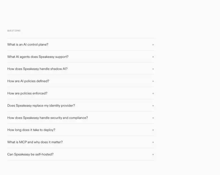 09faq
 10content?
 11footerLegal
How Speakeasy compares
- Body text
- 18px: larger than 71% of indexed sites (median 16px).
- Largest heading
- 86.4px: larger than 85% of indexed sites (median 60px).
- Type scale
- 1.25×: flatter than 62% of indexed sites (median 1.28×).
- Container
- 1344px: wider than 83% of indexed sites (median 1242px).
- Text contrast
- 18.9:1: higher than 65% of indexed sites (median 17.6:1).
- Page length
- 11,203px: longer than 76% of indexed sites (median 8,217px).
- Corner radius
- Mostly 5px, shared by 2 of 274 indexed sites (1%).
- Tobias
- One of 2 indexed sites that load Tobias (1%).
- ABC Diatype
- One of 3 indexed sites that load ABC Diatype (1%).
- Color scheme
- Light by default, like 75% of indexed sites. It is one of 49 sites (18%) that switch with the system dark mode setting.
In short
What font does Speakeasy use?
Speakeasy uses Tobias for headings. ABC Diatype (loaded as "ABCDiatype") is used for body text. ABC Diatype Mono (loaded as "ABCDiatypeMono") is used for code.
What are Speakeasy's brand colors?
Speakeasy's website uses a light scheme: background #FAFAFA, text #0F0A07, muted text #575251 and borders #0F0A071F.
How is Speakeasy's website laid out?
The most common corner radius is 5px, body text is 18px with 1.45 line height, and the page container is 1344px wide.