Typography
scale ratio 1.217- Robotobody400 500 600 70052%
- Poppinsdisplay400 500 60048%
| style | family | size | weight | line | tracking |
|---|---|---|---|---|---|
| display | Poppins | 52px | 500 | 1.2 | -0.012em |
| headline | Poppins | 42px | 500 | 1.2 | -0.02em |
| title | Poppins | 28px | 500 | 1.2 | 0em |
| body | Roboto | 16px | 400 | 1.5 | 0em |
| body-sm | Roboto | 12px | 500 | 1.2 | 0em |
| label | Roboto | 14px | 400 | 1.429 | 0.02em |
Type scale
Aa12Aa14Aa15Aa16Aa18Aa20Aa24Aa28Aa42Aa52
- Body size
- 16px / 1.5
- Display size
- 52px
- Display tracking
- -0.012em
- Case
- sentence
Color
light schemePalette by painted area
- Text on bg
- 13.37:1
- Muted on bg
- undefined:1
- Accent on bg
- 4.60:1
- Dark mode
- none
Space, shape & depth
Spacing scale (base 4px)
- 4
- 6
- 8
- 10
- 11
- 12
- 13
- 16
- 20
- 24
- 32
- 48
- 50
- 64
Corner radii
468141632pill
Shadows (1)
- Borders
- regular, 2px
- Section padding
- 128px
Components
exact computed valuesbutton-primary
Get a demo
- backgroundColor
- #0078CD
- textColor
- #FFFFFF
- rounded
- 4px
- padding
- 13px 16px
- height
- 44px
- fontFamily
- Roboto
- fontSize
- 14px
- fontWeight
- 700
- border
- 2px solid #0078CD
button-secondary
Get a demo
- backgroundColor
- #0072C3
- textColor
- #FFFFFF
- rounded
- 6px
- padding
- 0px 20px
- height
- 48px
- fontFamily
- Roboto
- fontSize
- 16px
- fontWeight
- 400
card
- rounded
- 14px
- padding
- 10px
- backgroundColor
- #F5F7FA
input
- rounded
- 4px
- height
- 45px
- padding
- 15px 15px
- backgroundColor
- #FFFFFF
- border
- 1px solid #C9D1DF
Layout & motion
- Container
- 1344px
- Grid columns
- 2
- Hero
- centered+media-below
- Navigation
- top-sticky+transparent
- Page height
- 9,625px
- Easing
- cubic-bezier(0.4, 0, 0.2, 1)
- Durations
- 150ms 200ms 300ms 500ms
- Transitions
- 52
- Keyframes
- 1
- Stack
- next.js, tailwind, radix-ui, sanity, mintlify, hubspot, vercel, cloudfront
Page sections (10)
section labels are heuristic 01nav
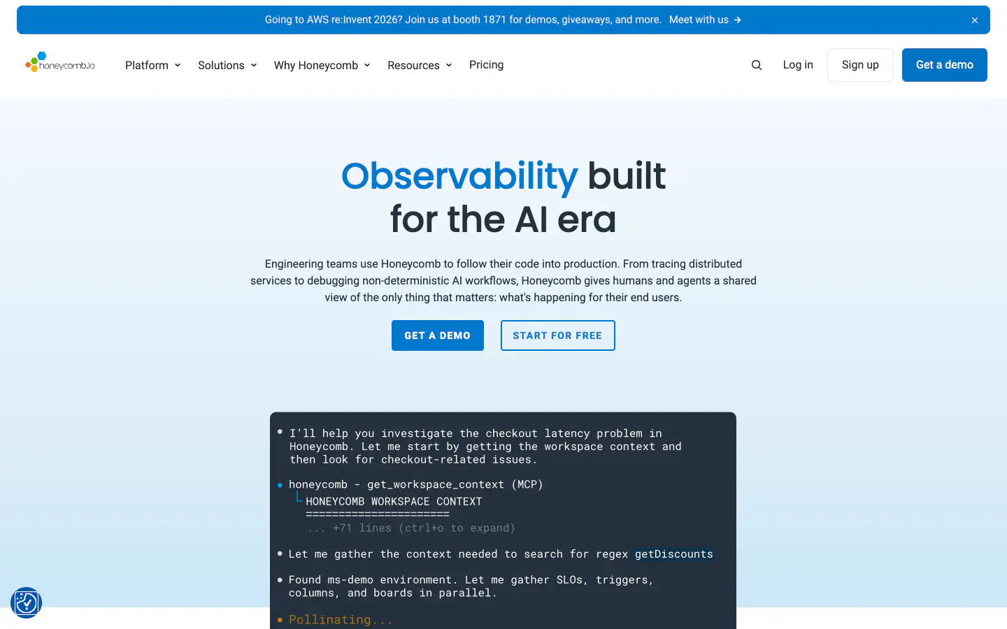
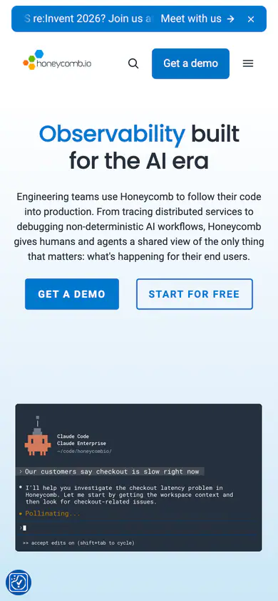
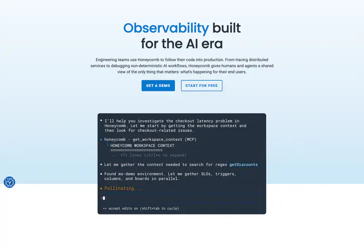 02herobuilt for the AI era Observability
 03logos
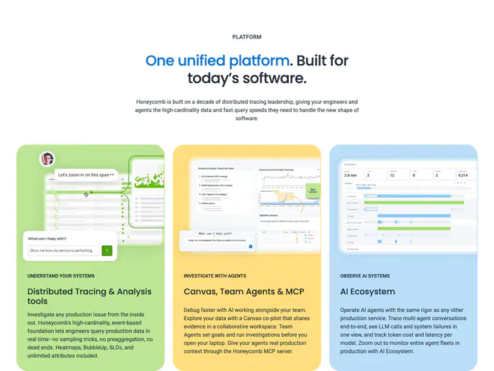 04feature detail?. Built for today’s software. One unified platform
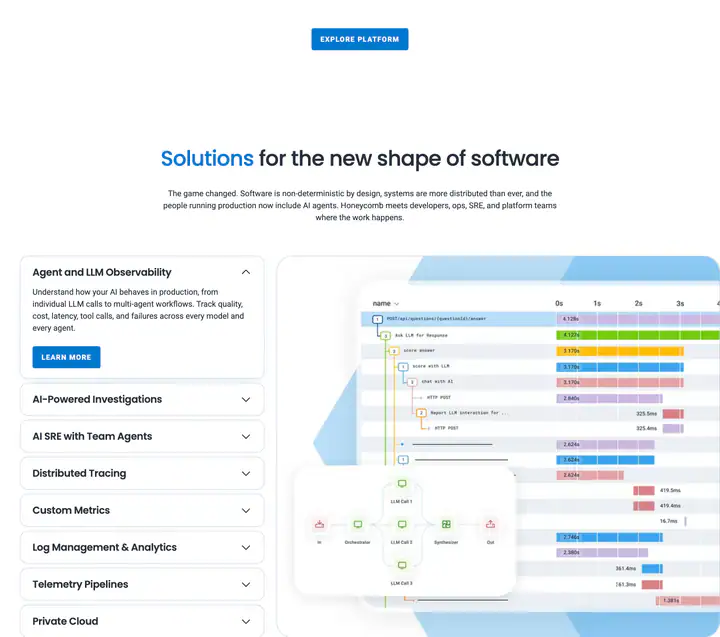 05feature detail?for the new shape of software Solutions
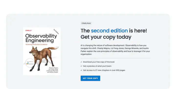 07feature detail?The is here! Get your copy today second edition
 08feature detail?Keep learning...
 09feature detail?Ready to get started?
 10footer
How Honeycomb compares
- Body text
- 16px, the same as 40% of indexed sites (median 16px).
- Largest heading
- 52px: smaller than 63% of indexed sites (median 60px).
- Type scale
- 1.22×: flatter than 74% of indexed sites (median 1.28×).
- Container
- 1344px: wider than 83% of indexed sites (median 1242px).
- Text contrast
- 13.4:1: lower than 85% of indexed sites (median 17.6:1).
- Page length
- 9,625px: longer than 64% of indexed sites (median 8,217px).
- Corner radius
- Mostly 4px, shared by 24 of 274 indexed sites (9%).
- Roboto
- One of 2 indexed sites that load Roboto (1%).
- Poppins
- The only site in the index that loads Poppins.
- Color scheme
- Light by default, like 75% of indexed sites. Like 82% of sites, it doesn't switch with the system dark mode setting.
In short
What font does Honeycomb use?
Honeycomb uses Roboto for body text. Poppins is used for headings.
What are Honeycomb's brand colors?
Honeycomb's website uses a light scheme: background #FFFFFF, surface #F3F4F6, text #25303E and borders #C9D1DF.
How is Honeycomb's website laid out?
The most common corner radius is 4px, body text is 16px with 1.5 line height, and the page container is 1344px wide.
Similar to Honeycomb
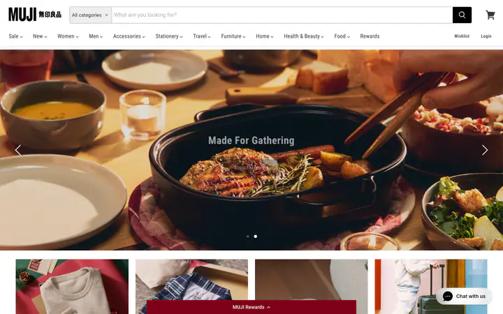
Roboto / Open Sans / Roboto Condensed#FFFFFF
Mujimuji.us
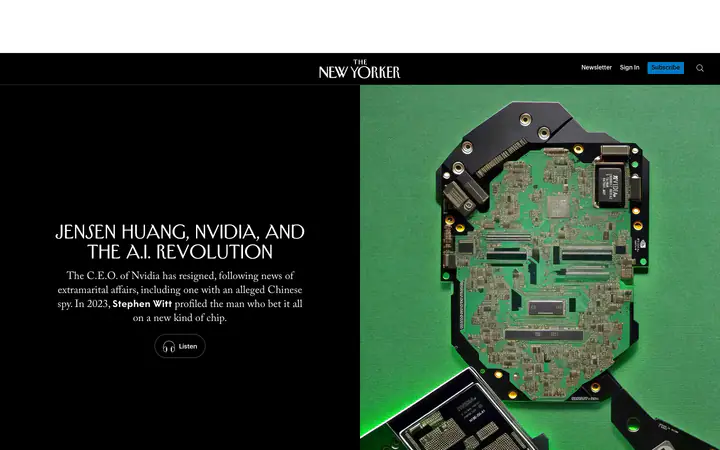
TNY Adobe Caslon Pro / Irvin Heading Pro / Neutraface New Yorker#FFFFFF
Newyorkernewyorker.com
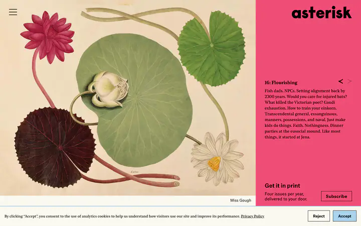
Noe Standard / Atlas Grotesk / Noe Text#FAF8F0
Asteriskmagasteriskmag.com
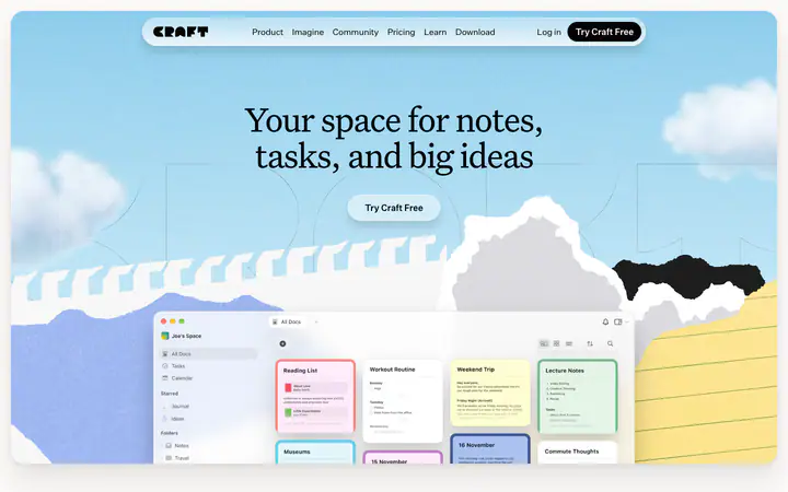
Untitled Serif Font / Untitled Sans Font / Inter Font#FCF9F7
Craftcraft.do
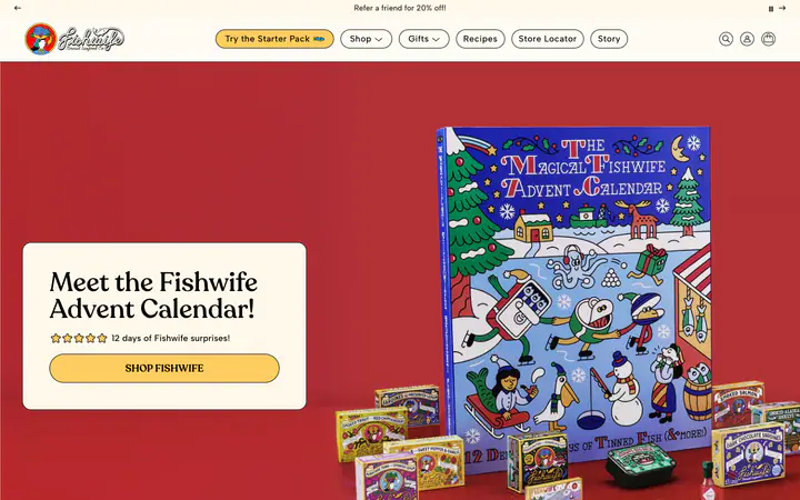
Recoleta / Albert Sans#FFFCF3
Eatfishwifeeatfishwife.com