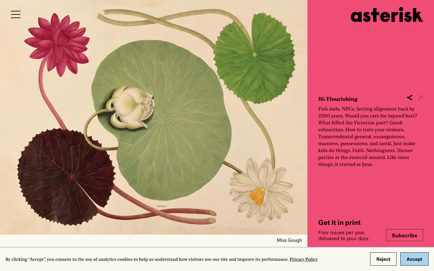
Typography
scale ratio 1.219- Noe Standarddisplay100 400 600 90051%
- Atlas Groteskother100 400 700 90032%
- Noe Textbody400 70017%
| style | family | size | weight | line | tracking |
|---|---|---|---|---|---|
| display | Noe Text | 18px | 700 | 0em | |
| headline | Atlas Grotesk | 21.6px | 700 | 0em | |
| body | Noe Text | 16.2px | 400 | 0em | |
| body-sm | Atlas Grotesk | 14.58px | 400 | 0em | |
| label | Atlas Grotesk | 16.2px | 700 | 0.02em |
Type scale
Aa11Aa14.5Aa16Aa18Aa21.5Aa29
- Body size
- 16px / null
- Display size
- 18px
- Display tracking
- 0em
- Case
- sentence
Color
light schemePalette by painted area
- Text on bg
- 19.75:1
- Muted on bg
- undefined:1
- Accent on bg
- 3.29:1
- Dark mode
- none
Declared accent tokens
- --c-primary#2D90CFpainted
Space, shape & depth
Spacing scale (base 6px)
- 3.5
- 9
- 18
- 36
- 54
- 68
- 90
Corner radii
Shadows (0)
none
- Borders
- hairline, 1px
- Section padding
- 53px
Components
exact computed valuesbutton-secondary
Sign up
- textColor
- #2D90CF
- rounded
- 0px
- padding
- 9px 18px
- height
- 40px
- fontFamily
- Atlas Grotesk
- fontSize
- 16.2px
- fontWeight
- 700
- border
- 1px solid #2D90CF
input
- rounded
- 0px
- height
- 31px
- padding
- 0px 0px
- border
- 1px solid #2D90CF
Layout & motion
- Container
- n/a
- Grid columns
- 3
- Hero
- split
- Navigation
- top-fixed+transparent
- Page height
- 3,269px
- Easing
- ease-in-out
- Durations
- 200ms 250ms 500ms
- Transitions
- 39
- Keyframes
- 0
- Stack
- google-tag-manager
Page sections (15)
section labels are heuristic 01nav
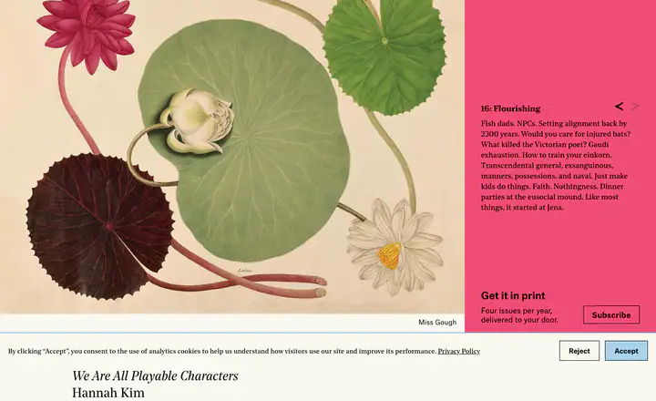 02heroWe Are All Playable Characters
 03feature detail?Living Well
 04feature detail?The Dream of an Aristotelian Machine
 05feature detail?Six Gutenberg Revolutions in a Row
 06feature detail?Why Don’t We Live in an Art Nouveau World?
 07feature detail?How to Turn a Philanderer Into a Father
 08feature detail?A Brief History of Our Place in the Universe
 09feature detail?Marginal Grains
 10feature detail?So You Want to Fight the Loneliness Epidemic
 11feature detail?In Search of the Universal Language
 12feature detail?Dead Poet Society
 13feature detail?The Optimal Amount of Coercion Is Non-Zero
 14feature detail?Christianity as an Alignment Technology
 15feature detail?Blinking Out
How Asteriskmag compares
- Body text
- 16px, the same as 40% of indexed sites (median 16px).
- Largest heading
- 18px: smaller than 96% of indexed sites (median 60px).
- Type scale
- 1.22×: flatter than 73% of indexed sites (median 1.28×).
- Text contrast
- 19.8:1: higher than 73% of indexed sites (median 17.6:1).
- Page length
- 3,269px: shorter than 85% of indexed sites (median 8,217px).
- Corner radius
- Mostly 0px, shared by 84 of 274 indexed sites (31%).
- Noe Standard
- The only site in the index that loads Noe Standard.
- Atlas Grotesk
- One of 2 indexed sites that load Atlas Grotesk (1%).
- Color scheme
- Light by default, like 75% of indexed sites. Like 82% of sites, it doesn't switch with the system dark mode setting.
In short
What font does Asteriskmag use?
Asteriskmag uses Noe Standard for headings. Atlas Grotesk is used for other. Noe Text is used for body text.
What are Asteriskmag's brand colors?
Asteriskmag's website uses a light scheme: background #FAF8F0, text #000000.
How is Asteriskmag's website laid out?
The most common corner radius is 0px, body text is 16px with null line height, and the page container is nullpx wide.
Similar to Asteriskmag

Atlas Grotesk / Sharp Grotesk#FFFFFF
Dropboxdropbox.com

Recoleta / Albert Sans#FFFCF3
Eatfishwifeeatfishwife.com
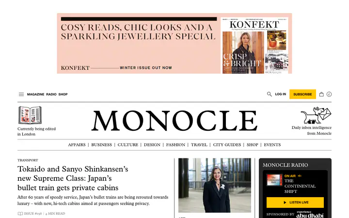
Plantin / Helvetica Neue / Monocons#FFFFFF
Monoclemonocle.com
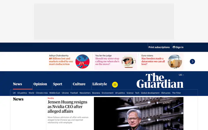
GH Guardian Headline / Guardian Text Sans#FFFFFF
Theguardiantheguardian.com

Untitled Serif Font / Untitled Sans Font / Inter Font#FCF9F7
Craftcraft.do