
Typography
scale ratio 1.320- SF Pro (system-ui)css: Geist Variablebody400 50085%
- Georgiacss: Exposuredisplay4009%
- Menlocss: ui-monospacemono4006%
| style | family | size | weight | line | tracking |
|---|---|---|---|---|---|
| display | Georgia | 64px | 400 | 1 | -0.07em |
| headline | SF Pro (system-ui) | 32px | 500 | 1.125 | -0.01em |
| title | SF Pro (system-ui) | 24px | 500 | 1.167 | 0em |
| body | SF Pro (system-ui) | 16px | 400 | 1.5 | 0em |
| body-sm | SF Pro (system-ui) | 13px | 500 | 1 | 0em |
| mono | Menlo | 16px | 400 | 1.5 | 0em |
Type scale
Aa11Aa13Aa14Aa15Aa16Aa18Aa20Aa24Aa32Aa64
- Body size
- 16px / 1.5
- Display size
- 64px
- Display tracking
- -0.07em
- Case
- sentence
Color
light schemePalette by painted area
- Text on bg
- 18.65:1
- Muted on bg
- 15.56:1
- Accent on bg
- 2.20:1
- Dark mode
- none
Declared accent tokens
- --brand-shell-blue#BD9FFFpainted
- --brand-shell-selection#C8BDF5not on page
Space, shape & depth
Spacing scale (base 4px)
- 4
- 8
- 10
- 12
- 16
- 20
- 23
- 24
- 28
- 32
- 40
- 48
- 80
- 100
Corner radii
830pill
Shadows (0)
none
- Borders
- hairline, 1px
- Section padding
- 112px
Components
exact computed valuesbutton-primary
- backgroundColor
- #272038
- textColor
- #FFFFFF
- rounded
- 9999px
- padding
- 0px 16px
- height
- 40px
- fontFamily
- Geist Variable
- fontSize
- 13px
- fontWeight
- 500
button-secondary
- backgroundColor
- #BD9FFF
- textColor
- #272038
- rounded
- 9999px
- padding
- 0px 16px
- height
- 40px
- fontFamily
- Geist Variable
- fontSize
- 13px
- fontWeight
- 500
card
- rounded
- 30px
- padding
- 0px
- backgroundColor
- #F1F1F2
Layout & motion
- Container
- 1280px
- Grid columns
- 2
- Hero
- left-over-media
- Navigation
- top-fixed+transparent
- Page height
- 6,900px
- Easing
- ease
- Durations
- 180ms 240ms 300ms 320ms
- Transitions
- 39
- Keyframes
- 0
- Stack
- astro, cloudflare
Page sections (9)
section labels are heuristic 01nav
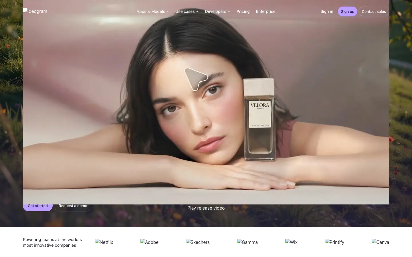
 02heroThe open models for visual intelligence.
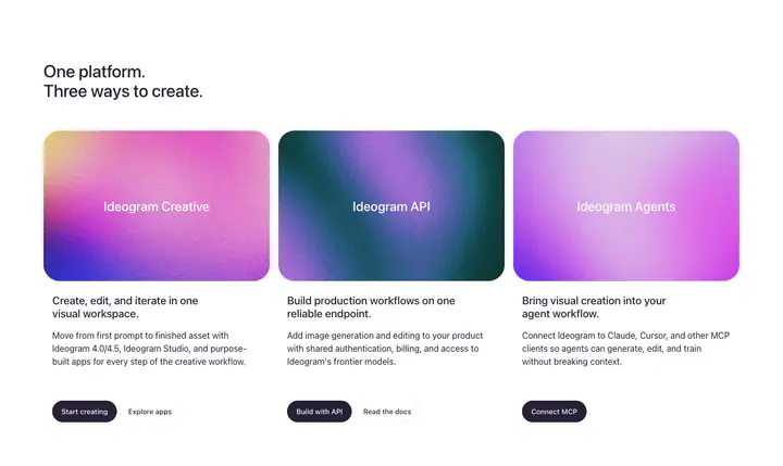 03features?One platform. Three ways to create.
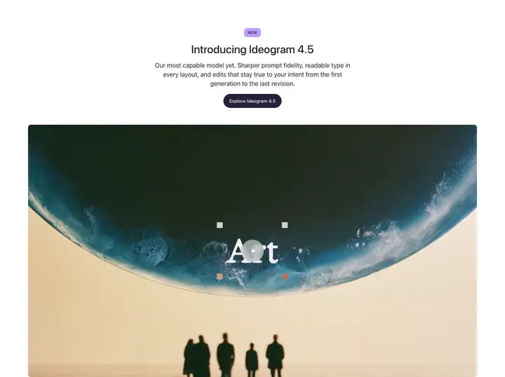 04feature detail?Introducing Ideogram 4.5
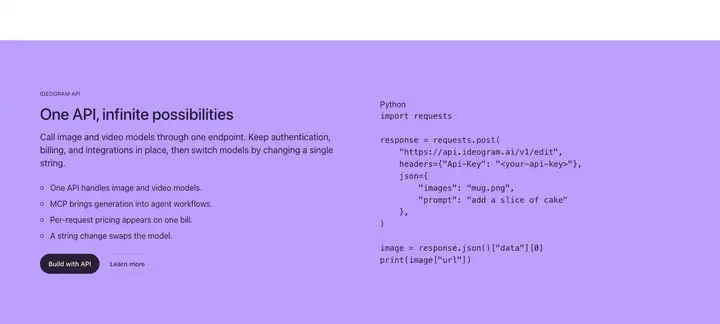 05code sample?One API, infinite possibilities
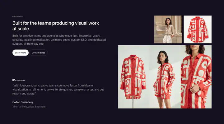 06testimonialsBuilt for the teams producing visual work at scale.
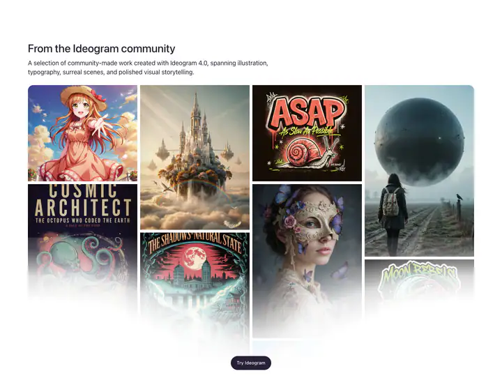 07gallery?From the Ideogram community
 08faqquestions Frequently asked
 09footer
How Ideogram compares
- Body text
- 16px, the same as 40% of indexed sites (median 16px).
- Largest heading
- 64px: larger than 56% of indexed sites (median 60px).
- Type scale
- 1.32×: steeper than 59% of indexed sites (median 1.28×).
- Container
- 1280px: wider than 55% of indexed sites (median 1242px).
- Text contrast
- 18.6:1: higher than 62% of indexed sites (median 17.6:1).
- Page length
- 6,900px: shorter than 62% of indexed sites (median 8,217px).
- Corner radius
- Mostly fully rounded (pill), shared by 53 of 274 indexed sites (19%).
- Color scheme
- Light by default, like 75% of indexed sites. Like 82% of sites, it doesn't switch with the system dark mode setting.
In short
What font does Ideogram use?
Ideogram uses SF Pro (system-ui) (loaded as "Geist Variable") for body text.
What are Ideogram's brand colors?
Ideogram's website uses a light scheme: background #FFFFFF, text #15101F, muted text #272038 and borders #EBEBEC.
How is Ideogram's website laid out?
The most common corner radius is fully rounded (pill), body text is 16px with 1.5 line height, and the page container is 1280px wide.