

Typography
scale ratio 1.134- Poly Sanscss: polySansui300 400 500 70054%
- Fk Roman Standardcss: fkRomanStandardbody40042%
- Manukacss: manukadisplay9003%
- Poly Sans Monocss: polySansMonomono300 400 500 600 7001%
| style | family | size | weight | line | tracking |
|---|---|---|---|---|---|
| display | Manuka | 90px | 900 | 0.8 | 0em |
| headline | Poly Sans | 24px | 700 | 1.1 | 0.01em |
| body | Fk Roman Standard | 16px | 400 | 1.3 | 0em |
| body-sm | Poly Sans | 11px | 400 | 1.2 | 0.1em |
| mono | Poly Sans Mono | 11px | 400 | 1.182 | 0.1em |
Type scale
Aa11Aa13Aa14Aa15Aa16Aa18Aa20Aa24Aa26Aa31Aa34
- Body size
- 16px / 1.3
- Display size
- 90px
- Display tracking
- 0em
- Case
- title
Color
light schemePalette by painted area
- Text on bg
- 18.58:1
- Muted on bg
- 8.86:1
- Accent on bg
- 7.49:1
- Dark mode
- follows system
Declared accent tokens
- --coral-sys-color-primary#5200FFpainted
- --coral-comp-coral-primary-color#5200FFpainted
Space, shape & depth
Spacing scale
- 2
- 4
- 6
- 8
- 10
- 12
- 14
- 15
- 16
- 18
- 20
- 21
- 24
- 30
Corner radii
23pill
Shadows (3)
- Borders
- hairline, 1px
- Section padding
- 251px
Components
exact computed valuesbutton-primary
Latest
- backgroundColor
- #5200FF
- textColor
- #FFFFFF
- rounded
- 9999px
- padding
- 10px 24px
- height
- 44px
- fontFamily
- Poly Sans Mono
- fontSize
- 12px
- fontWeight
- 600
button-secondary
Allow
- backgroundColor
- #000000
- textColor
- #FFFFFF
- rounded
- 0px
- padding
- 10px 18px
- height
- 38.2px
- fontFamily
- Poly Sans
- fontSize
- 14px
- fontWeight
- 400
Layout & motion
- Container
- 1100px
- Grid columns
- 2
- Hero
- left-aligned
- Navigation
- none-detected
- Page height
- 18,754px
- Easing
- ease
- Durations
- 150ms
- Transitions
- 11
- Keyframes
- 1
- Stack
- next.js, wordpress, google-tag-manager, fastly
Page sections (4)
section labels are heuristic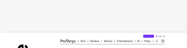 01hero
 03content?
How The Verge compares
- Body text
- 16px, the same as 40% of indexed sites (median 16px).
- Largest heading
- 90px: larger than 88% of indexed sites (median 60px).
- Type scale
- 1.13×: flatter than 99% of indexed sites (median 1.28×).
- Container
- 1100px: narrower than 75% of indexed sites (median 1242px).
- Text contrast
- 18.6:1: higher than 60% of indexed sites (median 17.6:1).
- Page length
- 18,754px: longer than 96% of indexed sites (median 8,217px).
- Corner radius
- Mostly 0px, shared by 84 of 274 indexed sites (31%).
- Poly Sans
- The only site in the index that loads Poly Sans.
- Fk Roman Standard
- The only site in the index that loads Fk Roman Standard.
- Color scheme
- Light by default, like 75% of indexed sites. It is one of 49 sites (18%) that switch with the system dark mode setting.
In short
What font does The Verge use?
The Verge uses Poly Sans (loaded as "polySans") for ui. Fk Roman Standard (loaded as "fkRomanStandard") is used for body text. Manuka (loaded as "manuka") is used for headings.
What are The Verge's brand colors?
The Verge's website uses a light scheme: background #FFFFFF, surface #F6F6F6, text #131313, muted text #4A4A4A and borders #E9E9E9.
How is The Verge's website laid out?
The most common corner radius is 0px, body text is 16px with 1.3 line height, and the page container is 1100px wide.