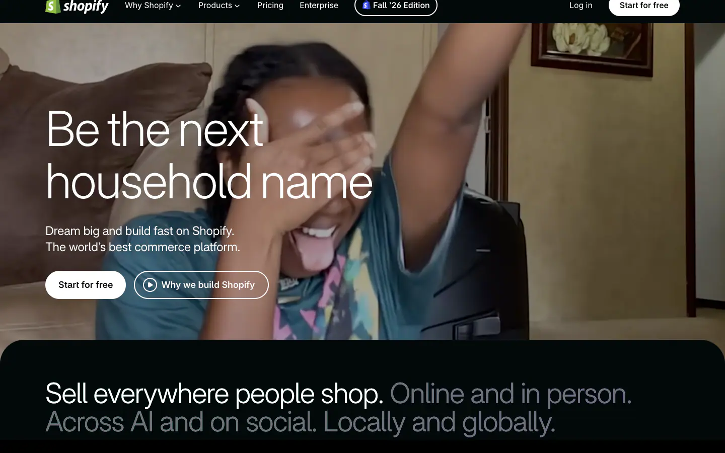

Typography
scale ratio 1.270- Shopify Intercss: Shopify-Interdisplay + body300 330 400 420 450 550100%
- Menlocss: ui-monospacemono4001%
| style | family | size | weight | line | tracking |
|---|---|---|---|---|---|
| display | Shopify Inter | 96px | 300 | 1.08 | -0.02em |
| headline | Shopify Inter | 56px | 330 | 1.08 | -0.03em |
| body | Shopify Inter | 18px | 400 | 1.4 | 0em |
| body-sm | Shopify Inter | 14px | 420 | 1.371 | 0em |
| label | Shopify Inter | 16px | 400 | 1.5 | 0em |
| mono | Menlo | 12px | 400 | 1.333 | 0em |
Type scale
Aa12Aa13Aa14Aa16Aa18Aa20Aa24Aa34Aa44Aa56Aa64Aa96
- Body size
- 18px / 1.4
- Display size
- 96px
- Display tracking
- -0.02em
- Case
- sentence
Color
dark schemePalette by painted area
- Text on bg
- 20.08:1
- Muted on bg
- 4.15:1
- Accent on bg
- 13.99:1
- Dark mode
- none
Space, shape & depth
Spacing scale (base 4px)
- 2
- 4
- 5
- 8
- 10
- 12
- 13
- 16
- 20
- 24
- 32
- 40
- 64
- 80
Corner radii
4812162048pill
Shadows (5)
- Borders
- hairline, 1px
- Section padding
- 128px
Components
exact computed valuesbutton-primary
Start for free
- backgroundColor
- #FFFFFF
- textColor
- #000000
- rounded
- 9999px
- padding
- 8px 20px
- height
- 44px
- fontFamily
- Shopify Inter
- fontSize
- 16px
- fontWeight
- 550
button-secondary
Fall ’26 Edition
- textColor
- #FFFFFF
- rounded
- 9999px
- padding
- 8px 13px
- height
- 44px
- fontFamily
- Shopify Inter
- fontSize
- 16px
- fontWeight
- 550
- border
- 2px solid #FFFFFF
- shadow
- rgba(0, 0, 0, 0) 0px 0px 0px 0px, rgba(0, 0, 0, 0) 0px 0px 0px 0px, rgba(0, 0, 0, 0) 0px 0px 0px 0px, rgb(255, 255, 255)
card
- rounded
- 12px
- padding
- 0px
- backgroundColor
- #060607
Layout & motion
- Container
- 1260px
- Grid columns
- 12
- Hero
- left-over-media
- Navigation
- none-detected
- Page height
- 10,958px
- Easing
- cubic-bezier(0.4, 0, 0.2, 1)
- Durations
- 150ms 200ms 300ms 500ms
- Transitions
- 126
- Keyframes
- 8
- Stack
- tailwind, cloudflare
Page sections (10)
section labels are heuristic 02content?
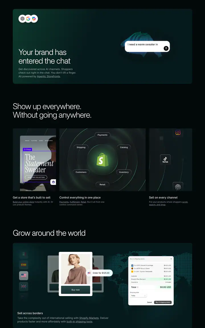 03features?Your brand has entered the chat
 04feature detail?For anyone from entrepreneurs to enterprise
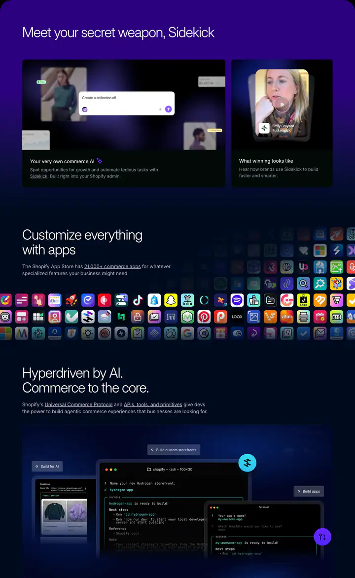 05features?Meet your secret weapon, Sidekick
 06feature detail?There’s no better place for you to build
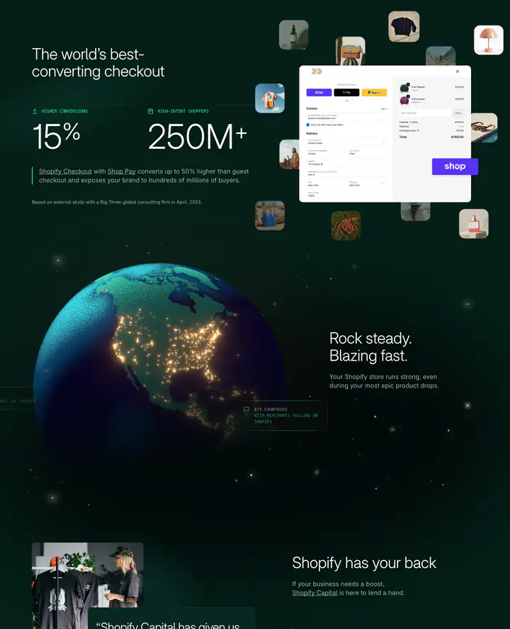 07gallery?The world’s best-converting checkout
 08feature detail?Shopify has your back
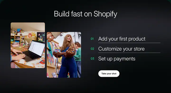 09cta?Build fast on Shopify
 10footerSupport
How Shopify compares
- Body text
- 18px: larger than 71% of indexed sites (median 16px).
- Largest heading
- 96px: larger than 89% of indexed sites (median 60px).
- Type scale
- 1.27×: flatter than 56% of indexed sites (median 1.28×).
- Container
- 1260px: wider than 52% of indexed sites (median 1242px).
- Text contrast
- 20.1:1: higher than 77% of indexed sites (median 17.6:1).
- Page length
- 10,958px: longer than 74% of indexed sites (median 8,217px).
- Corner radius
- Mostly 12px, shared by 14 of 274 indexed sites (5%).
- Shopify Inter
- The only site in the index that loads Shopify Inter.
- Color scheme
- Dark by default, like 25% of indexed sites. Like 82% of sites, it doesn't switch with the system dark mode setting.
In short
What font does Shopify use?
Shopify uses Shopify Inter (loaded as "Shopify-Inter") for headings and body text.
What are Shopify's brand colors?
Shopify's website uses a dark scheme: background #02090A, surface #041E18, text #FFFFFF, muted text #71717A and borders #FFFFFF.
How is Shopify's website laid out?
The most common corner radius is 12px, body text is 18px with 1.4 line height, and the page container is 1260px wide.