Typography
scale ratio 1.229- SF Pro (system-ui)css: system-uidisplay + body400 500 600100%
| style | family | size | weight | line | tracking |
|---|---|---|---|---|---|
| display | SF Pro (system-ui) | 72px | 600 | 1.056 | 0em |
| headline | SF Pro (system-ui) | 56px | 600 | 1.071 | 0em |
| title | SF Pro (system-ui) | 17px | 600 | 1.235 | 0em |
| body | SF Pro (system-ui) | 17px | 400 | 1.471 | 0em |
| body-sm | SF Pro (system-ui) | 14px | 400 | 1.429 | 0em |
Type scale
Aa12Aa14Aa17Aa19Aa21Aa28Aa48Aa56Aa56.5Aa72
- Body size
- 17px / 1.471
- Display size
- 72px
- Display tracking
- 0em
- Case
- sentence
Color
dark schemePalette by painted area
- Text on bg
- 17.33:1
- Muted on bg
- 5.21:1
- Accent on bg
- 2.73:1
- Dark mode
- none
Space, shape & depth
Spacing scale
- 4
- 6
- 8
- 10
- 12
- 14
- 16
- 18
- 20
- 22
- 24
- 32
- 40
- 48
Corner radii
9.522.53245pill
Shadows (4)
- Borders
- hairline, 1px
- Section padding
- 144px
Components
exact computed valuesbutton-primary
- backgroundColor
- #4D2FF5
- textColor
- #F5F5F7
- rounded
- 9.6px
- padding
- 0px 0px
- height
- 32px
- fontFamily
- system-ui
- fontSize
- 16px
- fontWeight
- 400
card
- rounded
- 32px
- padding
- 0px
- backgroundColor
- #111112
Layout & motion
- Container
- 1260px
- Grid columns
- 2
- Hero
- centered+media-below
- Navigation
- top-fixed+transparent
- Page height
- 24,784px
- Easing
- ease
- Durations
- 200ms 300ms 420ms 1100ms
- Transitions
- 289
- Keyframes
- 5
- Stack
- next.js, vercel
Page sections (22)
section labels are heuristic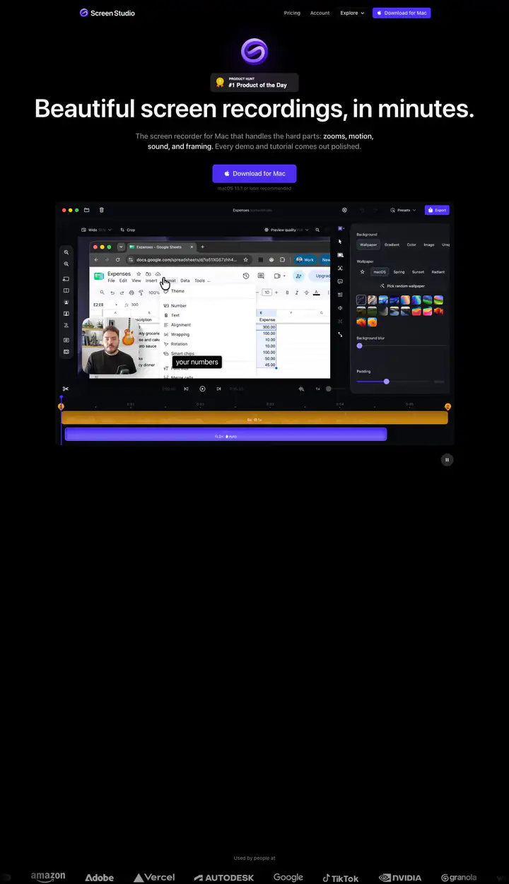 01heroBeautiful screen recordings, in minutes.
 02nav
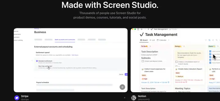 03gallery?Made with Screen Studio.
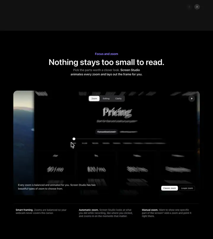 04feature detail?Nothing stays too small to read.
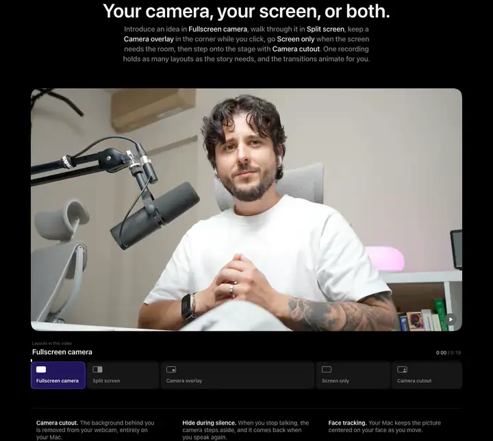 05feature detail?Your camera, your screen, or both.
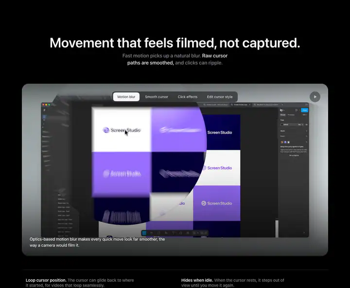 06feature detail?Movement that feels filmed, not captured.
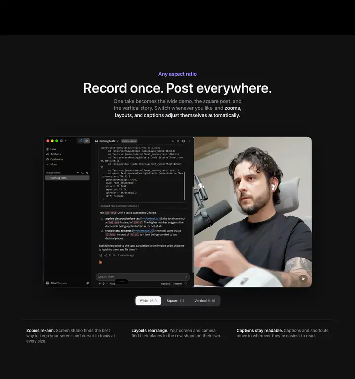 07feature detail?Record once. Post everywhere.
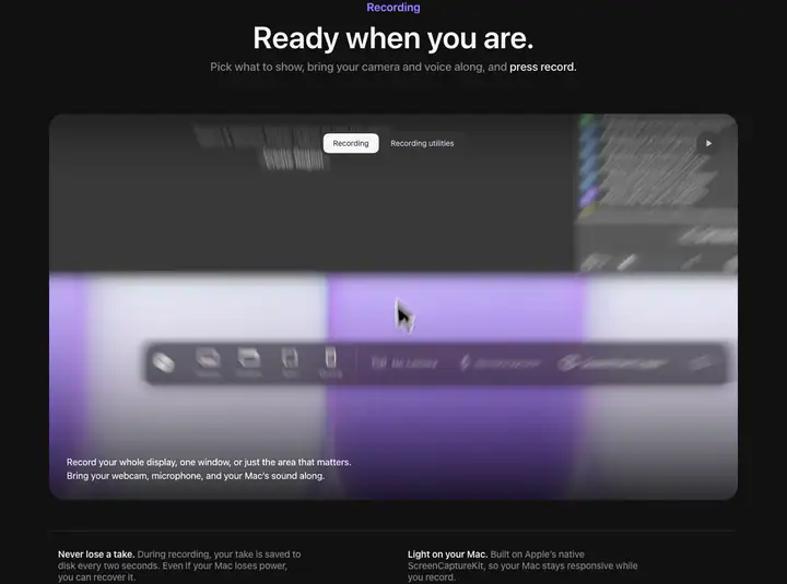 08feature detail?Ready when you are.
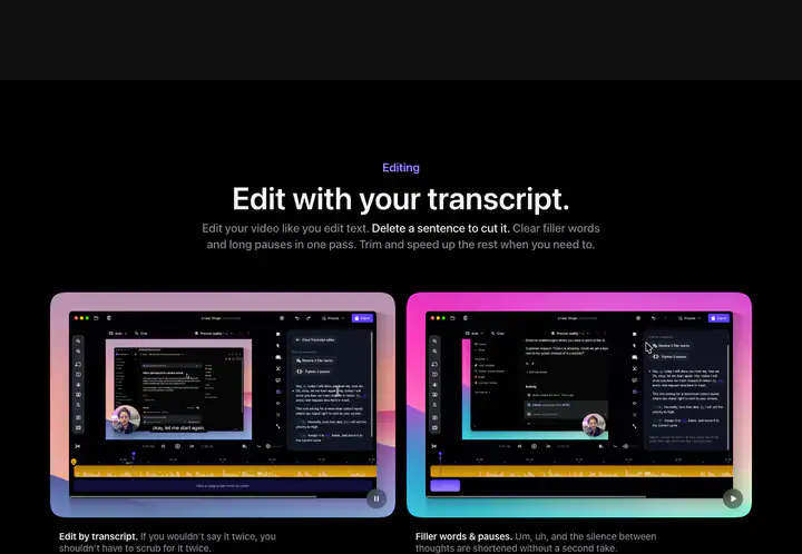 09testimonialsEdit with your transcript.
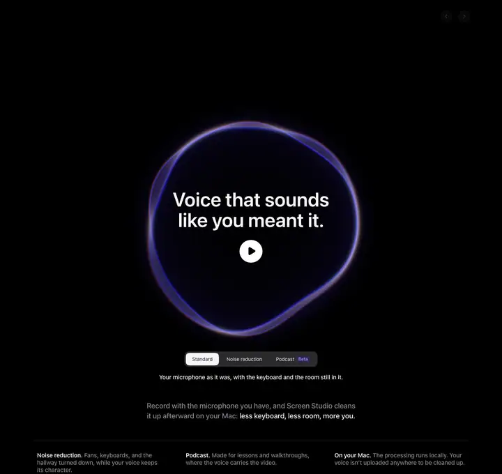 10feature detail?Voice that sounds like you meant it.
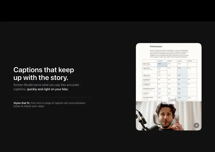 11feature detail?Captions that keep up with the story.
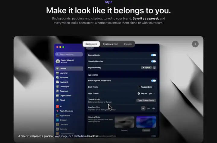 12feature detail?Make it look like it belongs to you.
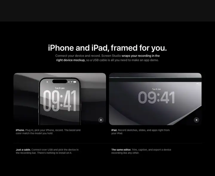 13testimonialsiPhone and iPad, framed for you.
 14feature detail?From stop to shared in seconds.
How Screen Studio compares
- Body text
- 17px: larger than 65% of indexed sites (median 16px).
- Largest heading
- 72px: larger than 70% of indexed sites (median 60px).
- Type scale
- 1.23×: flatter than 71% of indexed sites (median 1.28×).
- Container
- 1260px: wider than 52% of indexed sites (median 1242px).
- Text contrast
- 17.3:1: lower than 54% of indexed sites (median 17.6:1).
- Page length
- 24,784px: longer than 97% of indexed sites (median 8,217px).
- Corner radius
- Mostly 32px, shared by 1 of 274 indexed sites (0%).
- Color scheme
- Dark by default, like 25% of indexed sites. Like 82% of sites, it doesn't switch with the system dark mode setting.
In short
What font does Screen Studio use?
Screen Studio uses SF Pro (system-ui) (loaded as "system-ui") for headings and body text.
What are Screen Studio's brand colors?
Screen Studio's website uses a dark scheme: background #111112, surface #1D1D1F, text #F5F5F7, muted text #86868B and borders #FFFFFF24.
How is Screen Studio's website laid out?
The most common corner radius is 32px, body text is 17px with 1.471 line height, and the page container is 1260px wide.