Typography
scale ratio 1.186- Source Serif 4display + body400 60070%
- Albert Sansother400 500 60019%
- Interother400 500 6009%
- Plus Jakarta Sansother400 600 7002%
| style | family | size | weight | line | tracking |
|---|---|---|---|---|---|
| display | Source Serif 4 | 64px | 600 | 1.1 | -0.02em |
| headline | Source Serif 4 | 54px | 600 | -0.02em | |
| title | Albert Sans | 24px | 600 | 0em | |
| body | Source Serif 4 | 22.98px | 600 | 1.417 | 0em |
| body-sm | Source Serif 4 | 13.14px | 400 | 1.158 | 0em |
| label | Albert Sans | 16px | 500 | 1.375 | 0em |
Type scale
Aa9.5Aa12.5Aa13Aa14Aa14.5Aa16Aa20Aa22Aa23Aa24Aa28.5Aa32Aa40Aa54Aa64
- Body size
- 23px / 1.417
- Display size
- 64px
- Display tracking
- -0.02em
- Case
- sentence
Color
light schemePalette by painted area
- Text on bg
- 12.00:1
- Muted on bg
- 4.07:1
- Accent on bg
- 2.85:1
- Dark mode
- none
Space, shape & depth
Spacing scale
- 3
- 4
- 5.5
- 6
- 7.5
- 8.5
- 10
- 11
- 12
- 13
- 14.5
- 15.5
- 16
- 16.5
Corner radii
2111630.5pill
Shadows (4)
- Borders
- hairline, 1px
- Section padding
- 134px
Components
exact computed valuesbutton-primary
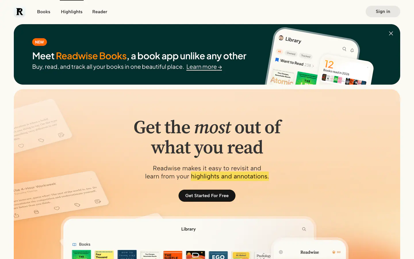
Get Started For Free
- backgroundColor
- #161616
- textColor
- #FFFFFF
- rounded
- 9999px
- padding
- 10px 24px
- height
- 42px
- fontFamily
- Albert Sans
- fontSize
- 16px
- fontWeight
- 600
card
- rounded
- 11.1px
- padding
- 11.1px
- backgroundColor
- #FFFFFF
- border
- 1px solid #DBD7CD
Layout & motion
- Container
- 1200px
- Grid columns
- 2
- Hero
- centered-over-media+media-below
- Navigation
- top-sticky+transparent
- Page height
- 7,545px
- Easing
- ease
- Durations
- 400ms 600ms 900ms 1200ms
- Transitions
- 49
- Keyframes
- 5
- Stack
- google-tag-manager, cloudflare
Page sections (12)
section labels are heuristic 01nav
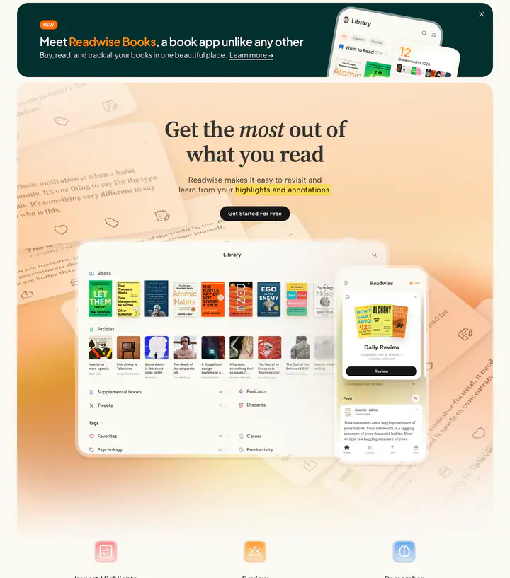 02heroMeet , a book app unlike any other
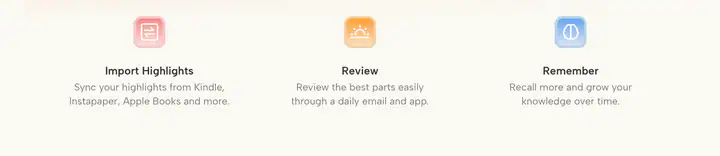 03features?Remember
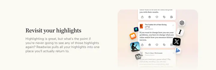 04feature detail?Revisit your highlights
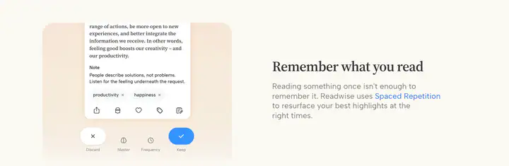 05feature detail?Remember what you read
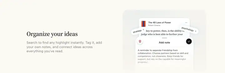 06feature detail?Organize your ideas
 07logosSync Readwise with your
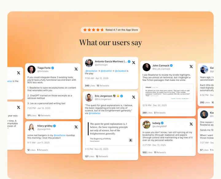 08testimonialsWhat our users say
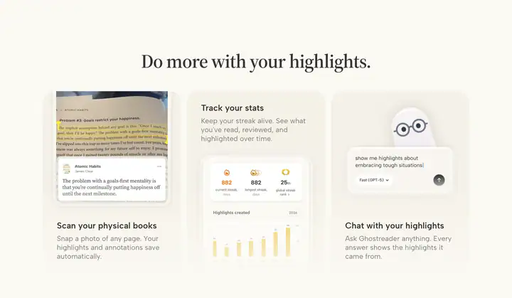 09features?Do more with your highlights.
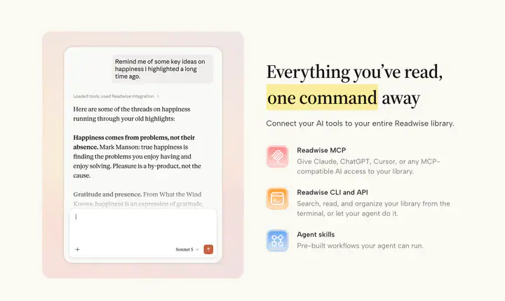 10features?Everything you’ve read, away
 11testimonialsStart reading with superpowers
 12footerLegal
How Readwise compares
- Body text
- 23px: larger than 98% of indexed sites (median 16px).
- Largest heading
- 64px: larger than 56% of indexed sites (median 60px).
- Type scale
- 1.19×: flatter than 88% of indexed sites (median 1.28×).
- Container
- 1200px: narrower than 57% of indexed sites (median 1242px).
- Text contrast
- 12.0:1: lower than 88% of indexed sites (median 17.6:1).
- Page length
- 7,545px: shorter than 57% of indexed sites (median 8,217px).
- Corner radius
- Mostly 11px, shared by 3 of 274 indexed sites (1%).
- Source Serif 4
- One of 2 indexed sites that load Source Serif 4 (1%).
- Albert Sans
- One of 2 indexed sites that load Albert Sans (1%).
- Color scheme
- Light by default, like 75% of indexed sites. Like 82% of sites, it doesn't switch with the system dark mode setting.
In short
What font does Readwise use?
Readwise uses Source Serif 4 for headings and body text. Albert Sans is used for other. Inter is used for other.
What are Readwise's brand colors?
Readwise's website uses a light scheme: background #FBF9F3, text #333333, muted text #7B7A79 and borders #DBD7CD.
How is Readwise's website laid out?
The most common corner radius is 11px, body text is 23px with 1.417 line height, and the page container is 1200px wide.