Typography
scale ratio 1.232- SF Pro (system-ui)css: system-uidisplay + body400 500 600100%
| style | family | size | weight | line | tracking |
|---|---|---|---|---|---|
| display | SF Pro (system-ui) | 70px | 600 | 1.1 | -0.005em |
| headline | SF Pro (system-ui) | 18px | 600 | 0.98 | 0.05em |
| title | SF Pro (system-ui) | 24px | 600 | 1.3 | -0.005em |
| body | SF Pro (system-ui) | 20px | 400 | 1.5 | -0.025em |
| body-sm | SF Pro (system-ui) | 14px | 400 | 1.15 | 0em |
| label | SF Pro (system-ui) | 14px | 600 | 1.4 | 0.02em |
Type scale
Aa14Aa16Aa18Aa20Aa24Aa30Aa40Aa48Aa60Aa70
- Body size
- 20px / 1.5
- Display size
- 70px
- Display tracking
- -0.005em
- Case
- sentence
Color
dark schemePalette by painted area
- Text on bg
- 18.73:1
- Muted on bg
- 7.88:1
- Accent on bg
- 4.49:1
- Dark mode
- none
Declared accent tokens
- --primary-color#0076FFpainted
- --nav-link-primary-color#0076FFpainted
- --nav-mobile-link-primary-color#0C7CFFpainted
Space, shape & depth
Spacing scale
- 4
- 6
- 8
- 10
- 12
- 20
- 24
- 25
- 26
- 32
- 36
- 37
- 40
- 42
Corner radii
24pill
Shadows (0)
none
- Borders
- hairline, 1px
- Section padding
- 130px
Components
exact computed valuesbutton-primary
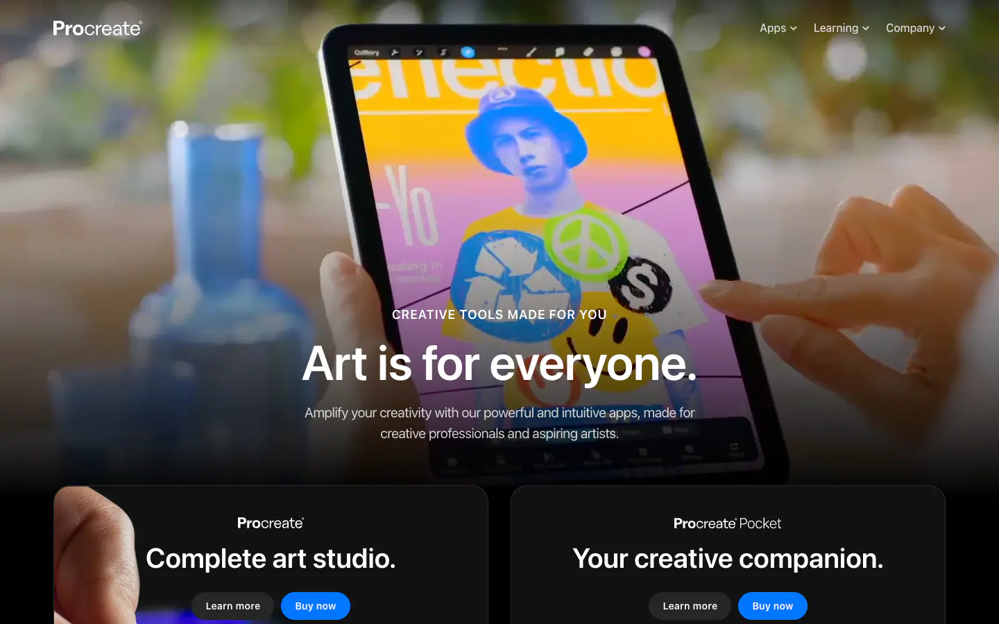
Buy now
- backgroundColor
- #0076FF
- textColor
- #FFFFFF
- rounded
- 9999px
- padding
- 10px 20px
- height
- 39.6px
- fontFamily
- SF Pro (system-ui)
- fontSize
- 14px
- fontWeight
- 600
button-secondary
Learn more
- backgroundColor
- #262626
- textColor
- #FFFFFF
- rounded
- 9999px
- padding
- 10px 20px
- height
- 39.6px
- fontFamily
- SF Pro (system-ui)
- fontSize
- 14px
- fontWeight
- 600
card
- rounded
- 24px
- padding
- 0px
- backgroundColor
- #121212
- border
- 1px solid #FFFFFF1A
Layout & motion
- Container
- 1366px
- Grid columns
- 12
- Hero
- centered-over-media
- Navigation
- top-static+transparent
- Page height
- 4,877px
- Easing
- ease
- Durations
- 100ms 150ms 200ms 1000ms
- Transitions
- 44
- Keyframes
- 0
- Stack
- nuxt, sanity, cloudfront
Page sections (6)
 01nav
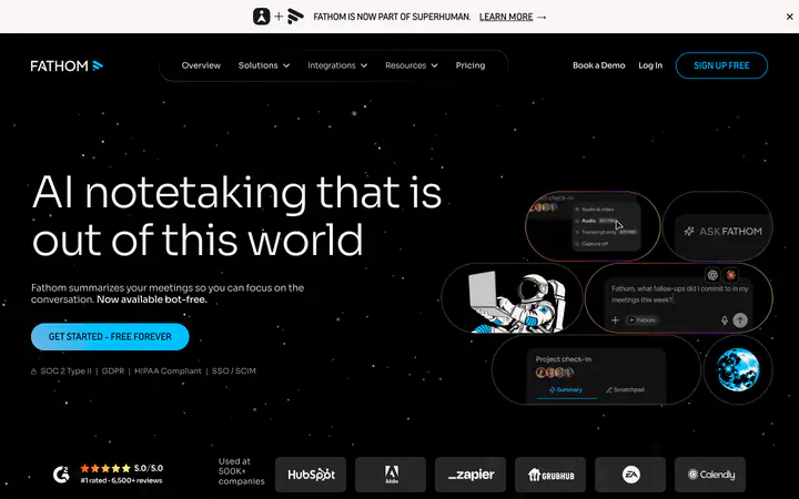
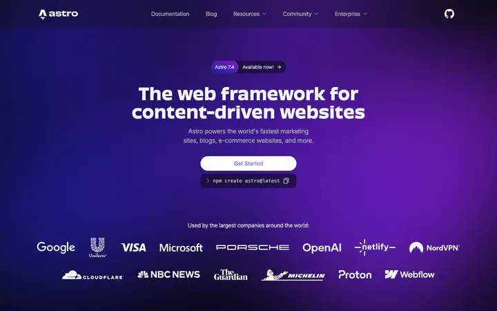
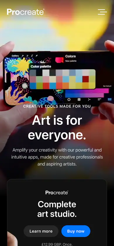
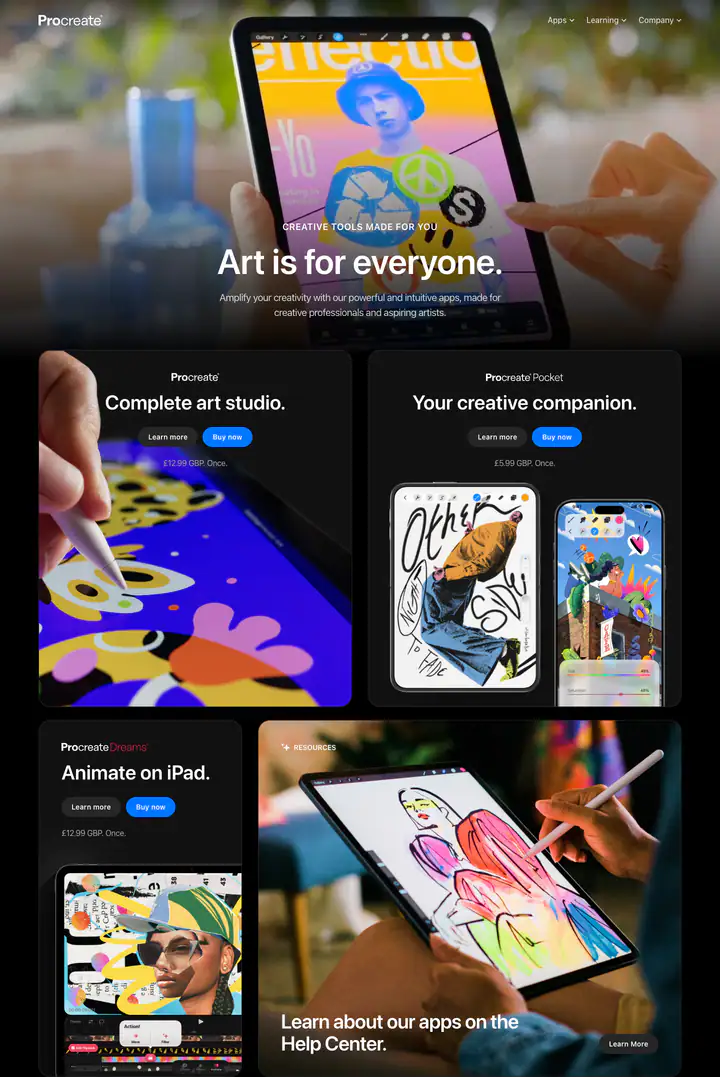 02heroArt is for everyone.
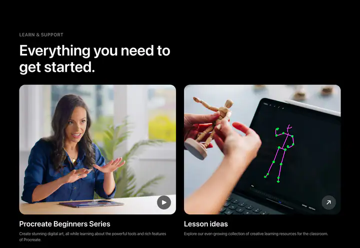 03featuresLearn & Support
 04ctaWe're hiring engineers.
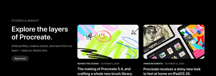 05ctaStories & Insight
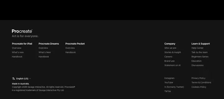 06footerLearn & Support
How Procreate compares
- Body text
- 20px: larger than 90% of indexed sites (median 16px).
- Largest heading
- 70px: larger than 68% of indexed sites (median 60px).
- Type scale
- 1.23×: flatter than 69% of indexed sites (median 1.28×).
- Container
- 1366px: wider than 93% of indexed sites (median 1242px).
- Text contrast
- 18.7:1: higher than 63% of indexed sites (median 17.6:1).
- Page length
- 4,877px: shorter than 79% of indexed sites (median 8,217px).
- Corner radius
- Mostly fully rounded (pill), shared by 53 of 274 indexed sites (19%).
- Color scheme
- Dark by default, like 25% of indexed sites. Like 82% of sites, it doesn't switch with the system dark mode setting.
In short
What font does Procreate use?
Procreate uses SF Pro (system-ui) (loaded as "system-ui") for headings and body text.
What are Procreate's brand colors?
Procreate's website uses a dark scheme: background #121212, text #FFFFFF, muted text #A8A8A8 and borders #FFFFFF1A.
How is Procreate's website laid out?
The most common corner radius is fully rounded (pill), body text is 20px with 1.5 line height, and the page container is 1366px wide.