Grafana design system
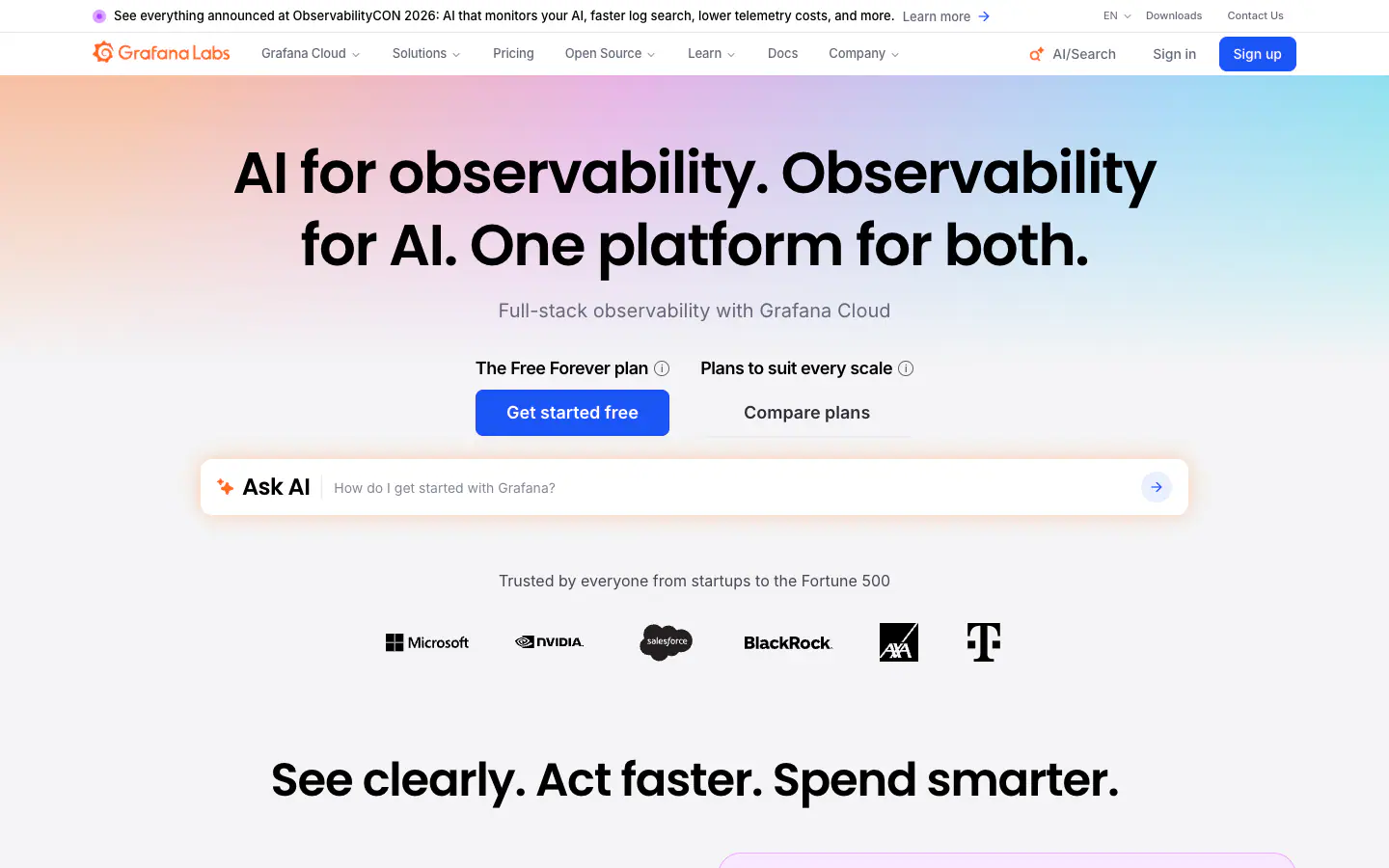

Use Grafana's design
Use Grafana's design system for this UI. Read https://emblematic.dev/sites/grafana.com/design.md (or, with the Emblematic MCP, get_design_md "grafana.com") and copy its exact values: don't invent colors, sizes or radii, and keep its typefaces with the listed fallbacks.
Similar to Grafana

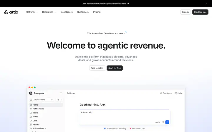
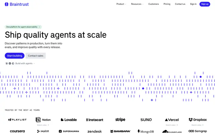

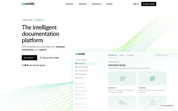
In short
What font does Grafana use?
Grafana uses Poppins for headings. Inter is used for body text.
What are Grafana's brand colors?
Grafana's accent color is #1B55F5. Its CSS also declares #1440E1 (--button-primary-accent) and #FF671D (--gmui-accent). Grafana's website uses a light scheme: background #F4F4F6, surface #FFFFFF, text #000000, muted text #454554 and borders #0000000F.
What are Grafana's body text size, corner radius and container width?
Body text is 16px with a line height of 1.5, the most common corner radius is fully rounded (pill) and the page container is 1280px wide.
Avoid lock-in and ensure reliability with Grafana Cloud, the AI-powered platform built on open standards unifies metrics, logs, traces, profiles, and business data.
Typography
scale ratio 1.208Text styles
| Style | Family | Size | Weight | Line | Tracking |
|---|---|---|---|---|---|
| display | Poppins | 60px | 600 | 1.25 | -0.025em |
| body | Inter | 16px | 400 | 1.5 | 0em |
Type scale
- Body
- 16px / 1.5
- Display
- 60px
- Display tracking
- -0.025em
- Case
- sentence
Color
light schemePalette by painted area
Contrast
- Text on background
- 19.12:1
- Muted on background
- 8.56:1
- Accent on background
- 5.22:1
- Dark mode
- None
Space, shape and depth
base 4pxSpacing
- 2
- 4
- 8
- 10
- 12
- 16
- 20
- 24
- 32
- 48
- 64
- 80
Corner radii
Shadows
- Borders
- hairline, 1px
- Section padding
- 96px
Components
computed values- backgroundColor
- #1B55F5
- textColor
- #FFFFFF
- rounded
- 8px
- padding
- 12px 20px
- height
- 48px
- fontFamily
- Inter
- fontSize
- 18px
- fontWeight
- 600
- border
- 1px solid #1440E1
- shadow
- rgba(0, 0, 0, 0) 0px 0px 0px 0px, rgba(0, 0, 0, 0) 0px 0px 0px 0px, rgba(0, 0, 0, 0) 0px 0px 0px 0px, rgba(0, 0, 0, 0) 0
- textColor
- #2E2E38
- rounded
- 8px
- padding
- 12px 20px
- height
- 48px
- fontFamily
- Inter
- fontSize
- 18px
- fontWeight
- 600
- border
- 1px solid #F4F4F6
- shadow
- rgba(0, 0, 0, 0) 0px 0px 0px 0px, rgba(0, 0, 0, 0) 0px 0px 0px 0px, rgba(0, 0, 0, 0) 0px 0px 0px 0px, rgba(0, 0, 0, 0) 0
- rounded
- 8px
- height
- 50px
- padding
- 12px 44px
- backgroundColor
- #FFFFFF
- border
- 1px solid #D8D8DF
Layout and motion
- Container
- 1280px
- Grid columns
- 4
- Hero
- centered
- Navigation
- top-sticky+transparent
- Page height
- 9,409px
- Easing
- cubic-bezier(0.4, 0, 0.2, 1)
- Durations
- 150ms 200ms 300ms
- Transitions
- 181
- Keyframes
- 2
- Stack
- next.js, tailwind, radix-ui, shadcn/ui, storyblok, vercel
Page sections
13

 03otherAsk AI
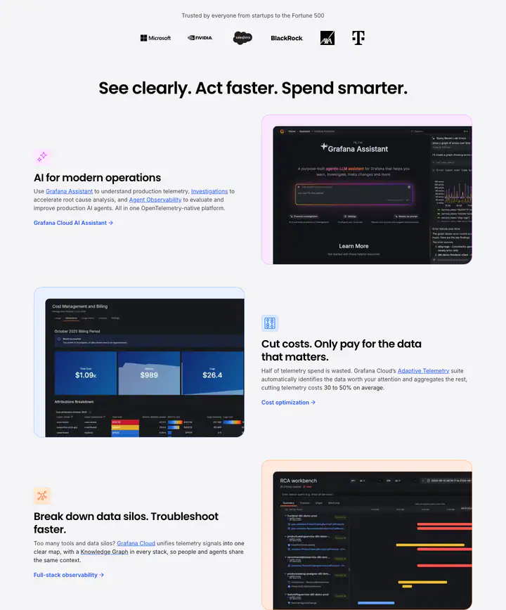 04Feature gridSee clearly. Act faster. Spend smarter.
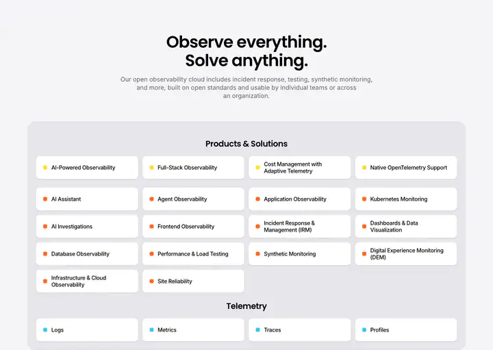
 07Stats sectionSecure. Compliant. Proven.
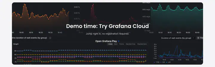
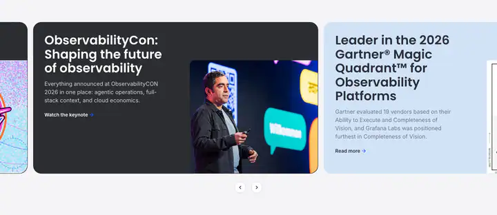
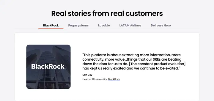
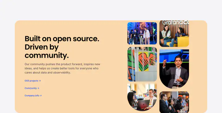
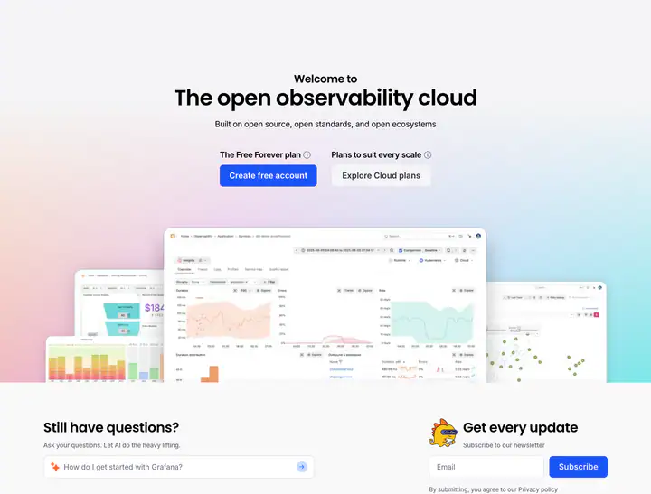 12Call to actionThe open observability cloud
How Grafana compares
against the whole index- Body text
- 16px, the same as 41% of indexed sites (median 16px).
- Largest heading
- 60px: smaller than 48% of indexed sites (median 60px).
- Type scale
- 1.21×: flatter than 78% of indexed sites (median 1.28×).
- Container
- 1280px: wider than 57% of indexed sites (median 1240px).
- Text contrast
- 19.1:1: higher than 66% of indexed sites (median 17.7:1).
- Page length
- 9,409px: longer than 61% of indexed sites (median 8,196px).
- Corner radius
- Mostly fully rounded (pill), shared by 71 of 392 indexed sites (18%).
- Poppins
- One of 5 indexed sites that load Poppins (1%).
- Inter
- One of 86 indexed sites that load Inter (22%).
- Color scheme
- Light by default, like 76% of indexed sites. Like 84% of sites, it doesn't switch with the system dark mode setting.
Read from the rendered page on Nov 17, 2026 (extractor 0.2.0). Fonts are matched to the site's own @font-face rules and colors come from computed styles. Values marked with a question mark are heuristics that have not been reviewed yet.