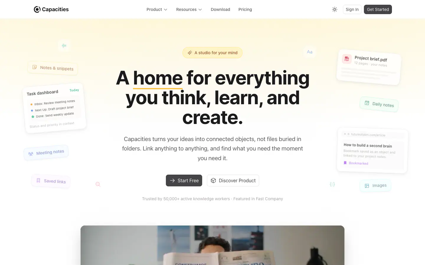
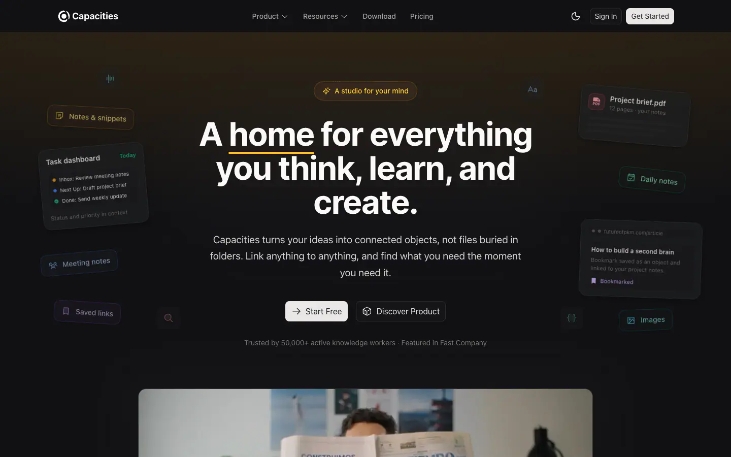

Typography
scale ratio 1.289- SF Pro (system-ui)css: ui-sans-serifbody400 500 600 70086%
- Interdisplay70014%
- JetBrains Monomono400 5001%
| style | family | size | weight | line | tracking |
|---|---|---|---|---|---|
| display | Inter | 64px | 700 | 1.05 | -0.03em |
| headline | SF Pro (system-ui) | 36px | 700 | 1.25 | -0.025em |
| title | SF Pro (system-ui) | 18px | 600 | 1.556 | -0.025em |
| body | SF Pro (system-ui) | 18px | 400 | 1.625 | 0em |
| body-sm | SF Pro (system-ui) | 15px | 400 | 1.625 | 0em |
| label | SF Pro (system-ui) | 14px | 400 | 1.429 | 0em |
| mono | JetBrains Mono | 12px | 400 | 1.333 | 0em |
Type scale
Aa10Aa11Aa12Aa13Aa14Aa15Aa16Aa17Aa18Aa20Aa28Aa36Aa48Aa64
- Body size
- 18px / 1.556
- Display size
- 64px
- Display tracking
- -0.03em
- Case
- sentence
Color
light schemePalette by painted area
- Text on bg
- 17.36:1
- Muted on bg
- 6.93:1
- Accent on bg
- 9.67:1
- Dark mode
- follows system
Space, shape & depth
Spacing scale (base 4px)
- 2
- 4
- 6
- 8
- 10
- 12
- 14
- 16
- 20
- 24
- 28
- 32
- 64
- 80
Corner radii
8121620pill
Shadows (5)
- Borders
- hairline, 1px
- Section padding
- 128px
Components
exact computed valuesbutton-primary
Get Started
- backgroundColor
- #454447
- textColor
- #F5F4F3
- rounded
- 8px
- padding
- 6px 10px
- height
- 32px
- fontFamily
- SF Pro (system-ui)
- fontSize
- 14px
- fontWeight
- 400
card
- rounded
- 16px
- padding
- 28px
- backgroundColor
- #FFFFFF
- border
- 1px solid #ECEBEA
- shadow
- rgba(0, 0, 0, 0) 0px 0px 0px 0px, rgba(0, 0, 0, 0) 0px 0px 0px 0px, rgba(0, 0, 0, 0) 0px 0px 0px 0px, rgba(0, 0, 0, 0) 0
Layout & motion
- Container
- 1280px
- Grid columns
- 3
- Hero
- centered+media-below
- Navigation
- top-static+transparent
- Page height
- 11,063px
- Easing
- cubic-bezier(0.4, 0, 0.2, 1)
- Durations
- 150ms 200ms 300ms 500ms
- Transitions
- 178
- Keyframes
- 1
- Stack
- nuxt, tailwind, shadcn/ui, cloudflare
Page sections (11)
section labels are heuristic 01nav
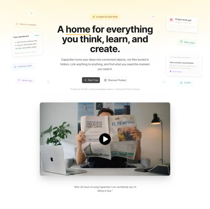 02hero
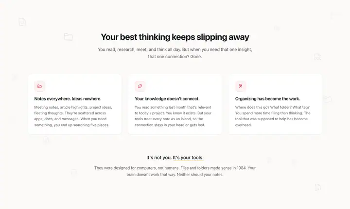 03features?Your best thinking keeps slipping away
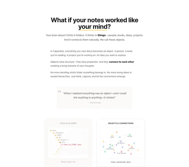 04features?? your mind What if your notes worked like
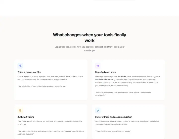 05testimonialsWhat changes when your tools finally work
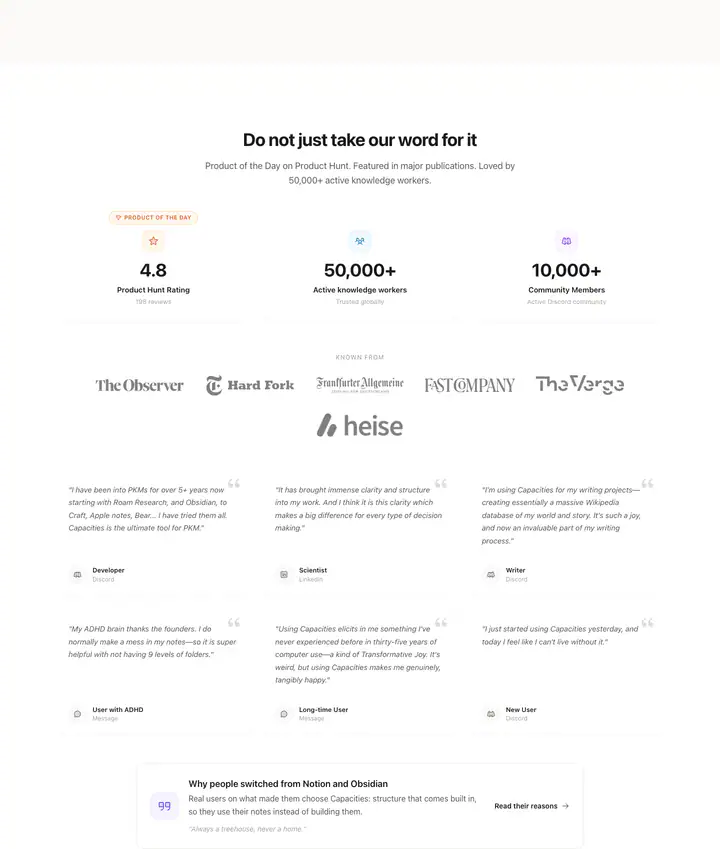 06testimonialsDo not just take our word for it
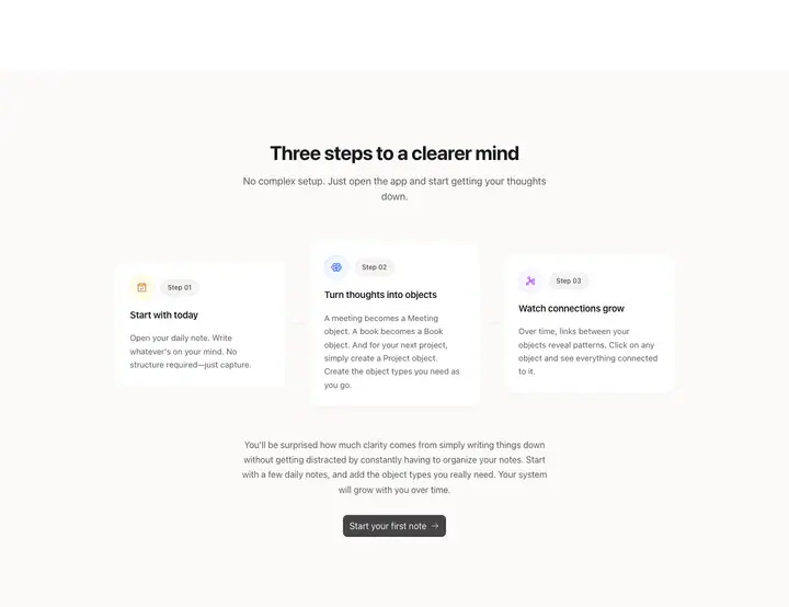 07features?Three steps to a clearer mind
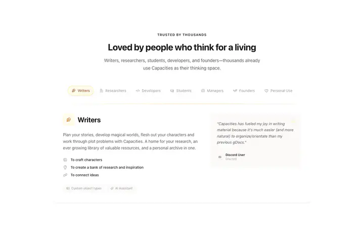 08feature detail?Loved by people who think for a living
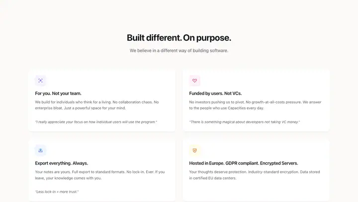 09features?Built different. On purpose.
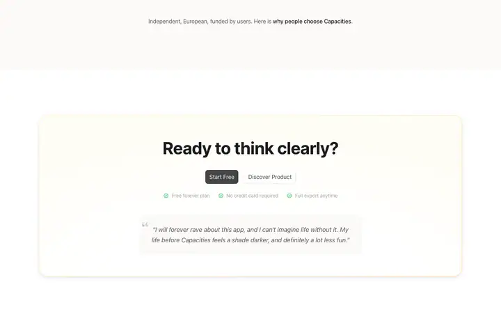 10feature detail?Ready to think clearly?
 11footerLegal
How Capacities compares
- Body text
- 18px: larger than 71% of indexed sites (median 16px).
- Largest heading
- 64px: larger than 56% of indexed sites (median 60px).
- Type scale
- 1.29×: steeper than 52% of indexed sites (median 1.28×).
- Container
- 1280px: wider than 55% of indexed sites (median 1242px).
- Text contrast
- 17.4:1: lower than 53% of indexed sites (median 17.6:1).
- Page length
- 11,063px: longer than 76% of indexed sites (median 8,217px).
- Corner radius
- Mostly 12px, shared by 14 of 274 indexed sites (5%).
- Inter
- One of 58 indexed sites that load Inter (21%).
- JetBrains Mono
- One of 11 indexed sites that load JetBrains Mono (4%).
- Color scheme
- Light by default, like 75% of indexed sites. It is one of 49 sites (18%) that switch with the system dark mode setting.
In short
What font does Capacities use?
Capacities uses SF Pro (system-ui) (loaded as "ui-sans-serif") for body text. Inter is used for headings. JetBrains Mono is used for code.
What are Capacities's brand colors?
Capacities's website uses a light scheme: background #FFFFFF, text #1A1A1D, muted text #5C5959 and borders #F5F4F3.
How is Capacities's website laid out?
The most common corner radius is 12px, body text is 18px with 1.556 line height, and the page container is 1280px wide.
Similar to Capacities
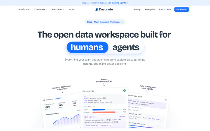
Inter / Degular / Bricolage Grotesque#FFFFFF
Deepnotedeepnote.com
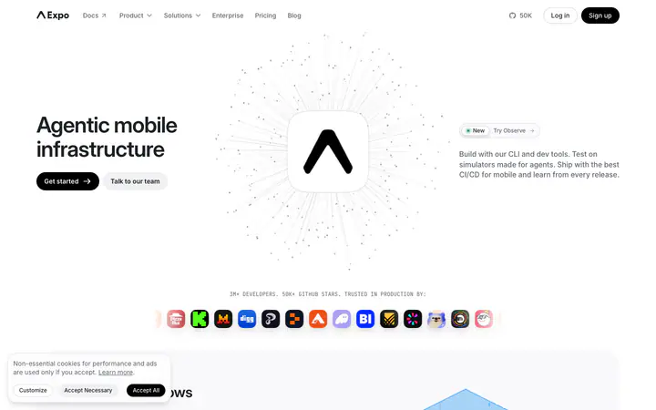
Inter / JetBrains Mono#FFFFFF
Expoexpo.dev
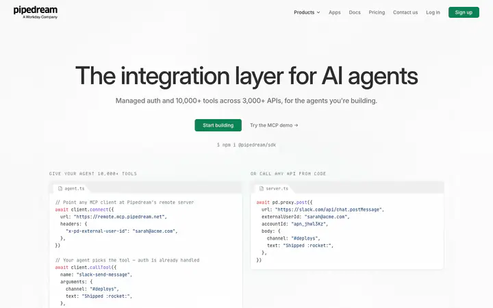
Inter / JetBrains Mono / Departure Mono#FFFFFF
Pipedreampipedream.com
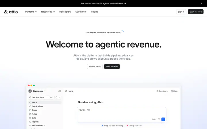
Inter / Inter Display / Tiempos Text#FFFFFF
Attioattio.com
GT Planar / Berkeley Mono / Inter#F7F7F7
Buildwithfernbuildwithfern.com